Carousels were the format quietly outperforming everything else on Instagram for the last two years, and that has not flipped in 2026. Internal data from creator analytics tools like Later and Metricool consistently shows carousels pulling 1.7x to 3x the engagement rate of single-image posts and beating Reels on saves by a wide margin. Saves and shares are the two signals Instagram's ranking model weights most heavily right now, which is why a slow-burn educational carousel routinely out-reaches a slick Reel from the same account.
So the question is not whether to post carousels. The question is how to design Instagram carousels that actually earn the swipes, saves, and shares the algorithm rewards. Most accounts get this wrong in predictable ways. Below is a tactical breakdown that strips out the generic advice and focuses on what moves numbers.
The first slide is the only slide that matters until it works
If your first slide does not earn the swipe, nothing else you designed gets seen. Treat slide one as a hook, not a title. The hook needs to do exactly one thing: make the reader feel they will lose something by scrolling past.
The formats that consistently earn swipes:
- Specific numerical promise. "I tested 7 hook formulas on 312 carousels. Two of them ate the others alive."
- Strong contrarian claim. "Stop posting on Tuesdays. The data is lying to you."
- Named callout. "Why MrBeast's thumbnails work and yours do not, broken down frame by frame."
- Visible problem. A screenshot or photo with something obviously wrong, then "swipe to see what changed."
What does not work: titles. "Top 10 productivity tips" is a bookshelf, not a hook. There is no tension, no reason to swipe.
Design-wise the first slide should be loud. Solid background, oversized type, one focal element. If a viewer needs more than two seconds to read it, you have lost them. Keep the headline under nine words.
Build a story that pulls them through ten slides
A carousel with no narrative arc is just a slide deck. The accounts that get reach treat carousels like a five-act script: hook, tension, reveal, payoff, CTA.
A reliable structure:
- Hook (slide 1) — the promise.
- Stakes (slide 2) — why this matters or what is at risk.
- The setup (slides 3-5) — context, the framework, the data.
- The payoff (slides 6-8) — the actual answer or how-to.
- The escalation (slide 9) — the deeper insight that goes beyond the obvious.
- The CTA (slide 10) — save, share, comment, or follow.
Most creators front-load everything into slides one through three and then pad. The opposite is correct. Each slide should add one new piece of information that the previous slide could not deliver. If you can cut a slide without anyone noticing, cut it.
Mobile is the only screen that exists
Over 80% of Instagram sessions happen on mobile. Optimizing for desktop preview is a waste of time. Three rules for mobile-first design:
- Type at least 28pt for body, 48pt for headlines. Anything smaller becomes unreadable on a 6-inch phone in landscape sun.
- Limit body text to 100-120 characters per slide. That is roughly two short sentences. More than that and people scroll past on the second tap.
- Test at thumb distance. Hold your phone at arm's length. If you cannot read the headline, the design is broken.
A shortcut that works: build in a 1080x1350 frame with a 60-pixel safe zone on every edge. Instagram crops aggressively in some surfaces (Explore, the new For You feed). The safe zone keeps your text readable everywhere.
Use carousel-specific design moves competitors will not
Most carousels use ten standalone slides that share a template. The accounts that explode use the format itself as a design tool.
| Move | What it does | Best for |
|---|---|---|
| Panorama | One image stretched across multiple slides, revealed by swiping | Travel, food, before/after |
| Continuation arrow | A subtle "→" or peek-of-content at the right edge | Tutorial, list |
| Reveal frame | Slide N hides what slide N+1 shows | Trivia, comparison |
| Page numbers | "1/10" in the corner sets expectation, lifts completion rate | Long-form, deep dives |
| Repeated CTA bar | A thin bar at the bottom of every slide ("Save for later") | High-save educational content |
These moves cost you fifteen minutes in the editor and earn you swipes that templates cannot. The continuation arrow alone usually lifts swipe-through rate by 20-40% in our tests.
Mix media when it serves the story
Instagram lets you combine photos, videos, and graphics in a single carousel. Use it. A carousel that opens with a 3-second video clip, transitions to two static slides explaining what just happened, then ends with a still CTA outperforms an all-static version on watch time and shares.
A few combinations that consistently land:
- Video hook (1) → static breakdown (2-8) → video result (9) → CTA (10)
- Photo before (1) → process slides as text + screenshots (2-6) → photo after (7) → key takeaway (8) → CTA (9)
- Bold question (1) → answer in 6 numbered slides (2-7) → "save this for later" (8)
Do not mix media just to look fancy. Each format change should match a shift in pace. If you switch media four times in ten slides, you have a slide deck with ADHD.
The posting moves that matter
Writing and designing the carousel is 80% of the work. The remaining 20% is what most creators ignore.
- Caption is part of the carousel. Open with a one-line hook that mirrors slide one, then expand. Long captions (150+ words) outperform short ones for educational content because they keep users on the post longer, which Instagram reads as engagement.
- First comment, not caption. Drop hashtags and any external links in the first comment. Keeps the caption clean and readable.
- Hashtag count: 3-5 specific. The 30-hashtag spray approach is dead. Three highly relevant niche tags outperform 30 generic ones.
- Pin a CTA comment yourself. "Which of these will you try first?" pinned at the top primes others to comment.
- Post when your audience scrolls, not when guides say to. Check Instagram Insights → Most Active Times. For most B2B accounts in 2026 that is Tuesday-Thursday between 11 AM and 1 PM local time, but yours may differ.
One posting habit that compounds: reply to every comment in the first hour. Comment velocity in the first hour is one of the strongest ranking signals. A carousel that gets ten thoughtful replies in 60 minutes will reach 5-10x the audience of one that gets zero.
Tools worth your time
We ranked the major options in our roundup of the best carousel maker apps in 2026; here are the four that come up most:
- Canva. Templates, brand kits, the Magic Resize feature for repurposing across formats. Free tier is enough for most creators.
- Figma. If you want pixel control and reusable component libraries, this is the move. Steeper learning curve.
- Later or Metricool. Scheduling plus carousel-specific analytics (slide-by-slide drop-off, save rate, etc.).
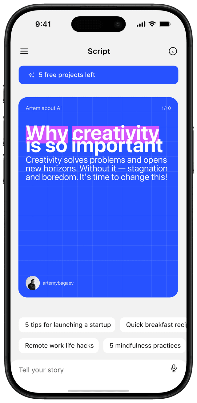
- Reframe. Speak your idea as a 30-second voice note, the app generates the script and designs the slides. The fastest path from "I want to post about X" to a finished carousel exists right now. Try it free on the App Store.
Why this matters in 2026
The creator economy keeps consolidating attention into fewer formats and fewer hands. Carousels remain one of the few formats where a small account can still go viral on quality alone, because saves and shares (which carousels disproportionately earn) carry more weight than view count in the current ranking model.
The creators who treat carousel design as a craft rather than a chore will keep compounding reach through 2026. The ones who keep posting templated 10-slide decks will keep wondering why their numbers stagnate.
What to do this week
- Audit your last 10 carousels. Calculate your average swipe-through to slide 5. If it is under 50%, your hook is the problem.
- Pick one design move from the table above (panorama, continuation arrow, reveal frame) and use it on your next post.
- Rewrite slide one as a numerical promise, contrarian claim, or named callout. Drop the title style.
- Move hashtags to the first comment. Cut the count to 5.
- Reply to every comment in the first hour for your next three posts. Track whether reach changes.
Doing all five takes about two hours of effort and shifts results within a week.
Frequently asked questions
What makes an Instagram carousel go viral?
A scroll-stopping first slide, a clear story arc across 8-10 slides, and density that earns saves. Carousels go viral when each slide adds new information the previous one could not deliver, ending with a clear save or share prompt.
How many slides for a viral carousel?
8-10 slides is the sweet spot for educational content in 2026. Longer formats (12-20) only work when each extra slide adds genuinely new information; otherwise viewers drop off after slide 4.
What's the best first slide for a carousel?
A specific numerical promise, a contrarian claim, or a visible problem. Avoid generic titles like "Top 10 productivity tips." The first slide should make the reader feel they will lose something by scrolling past.
Do AI-generated carousels work?
Yes, when used as a first draft. AI tools like Reframe, PostNitro, and Contentdrips generate the script and design, but human editing of the hook and pacing is what separates a carousel that earns saves from one that gets ignored.